

Welcome to RMP’s new Generation 2 map of the Ann Arbor Dioxane 1,4 Plume. This is RMP’s first Gen2 map and is a leap forward in RMP’s environmental mapping software and it’s free to use for anybody with an internet connection.
CLICK HERE TO OPEN THE MAP IN NEW WINDOW, THEN BOOKMARK IT IN YOUR FAVORITES
Continue reading more about RMP’s new map of Ann Arbor, Michigan…
RMP uses Google Maps which most people are already familiar with. That means all the normal controls you’re already used to with Google Maps are also available on our new map. It also means there is no software to download/install like Google Earth or ARCGIS. Because RMP uses Google Maps it also means that our maps are simple & fast. Even though RMP’s maps are simple Google maps, they are super data rich and this post will give a quick set of “how to” instructions to show you or your students how to use this map to learn more about the contamination of Ann Arbor’s ground water with 1,4 Dioxane. If you’re a school teacher or instructor that wants to learn more about how this map works or the data that underpins this map, you can email Matt Wandel at respectmyplanet@gmail.com and I would be glad to show you more about how this map works and answer any questions you have about the depth of the data sets used to generate this map. This post includes two methods to show you how to use our new map: 1) YouTube instructional video, and 2) written documentation that explains the basics of the map. Let’s get started:
Watch the video above to get an overview of how our new map works. If you prefer written documentation, keep reading to see a simple step-by-step tutorial with screen shots.
Map Overview
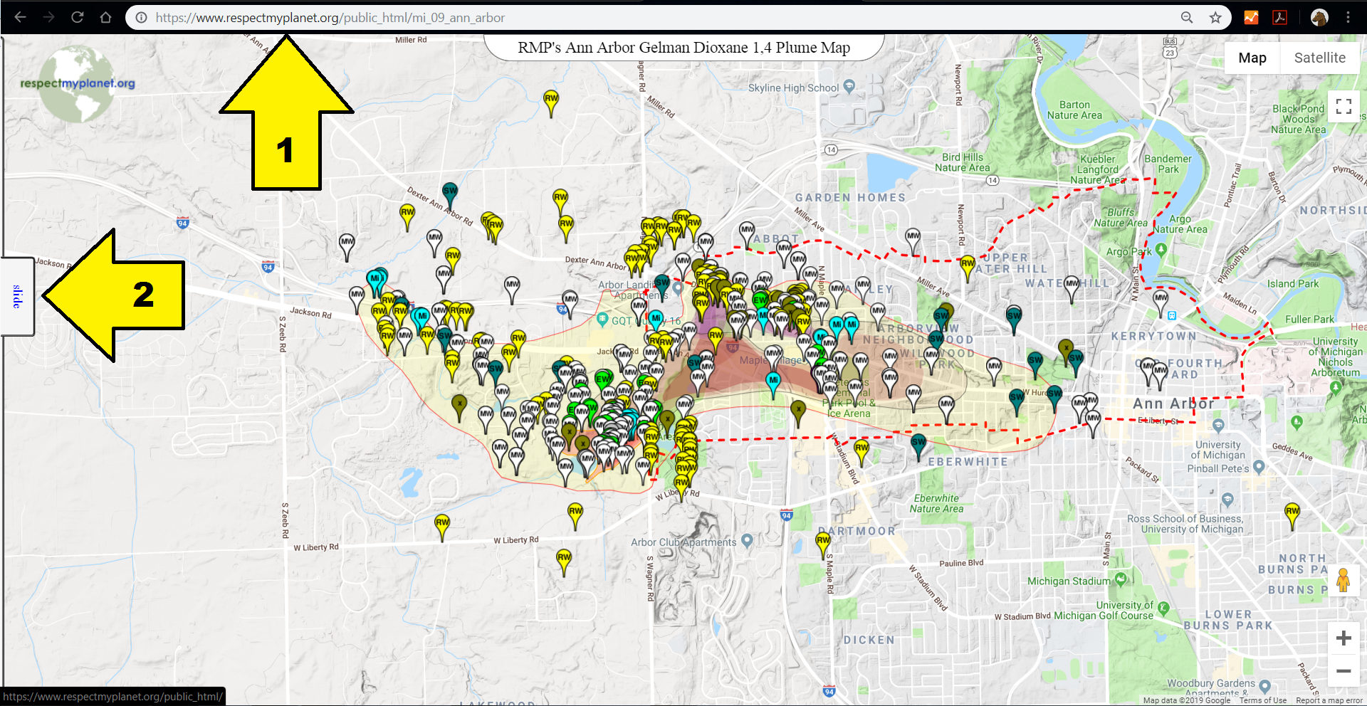
Arrow #1 – This is map’s URL (https://www.respectmyplanet.org/public_html/mi_09_ann_arbor) which you can/should bookmark in your web browser favorites. This URL will never change. When you load the map, you will be centered over Ann Arbor Michigan and you will see four distinct Dioxane 1,4 contamination plumes, the groundwater prohibition zone (dashed red line), and 464 unique points of interest (markers) that are all clickable to get more information. Depending on when you read this post, more markers may have been added. This map will always be evolving as new data becomes available but the mechanics of how simple the map is to use will never change.
Arrow #2 – Click on the “Slide” tab on the left hand side of your screen to slide out the control panel to get access to four different panels that each provide more information about the map. Go ahead and click on the slide button and then we will take a look at each of the four control panels.
Control Panel – Marker Info
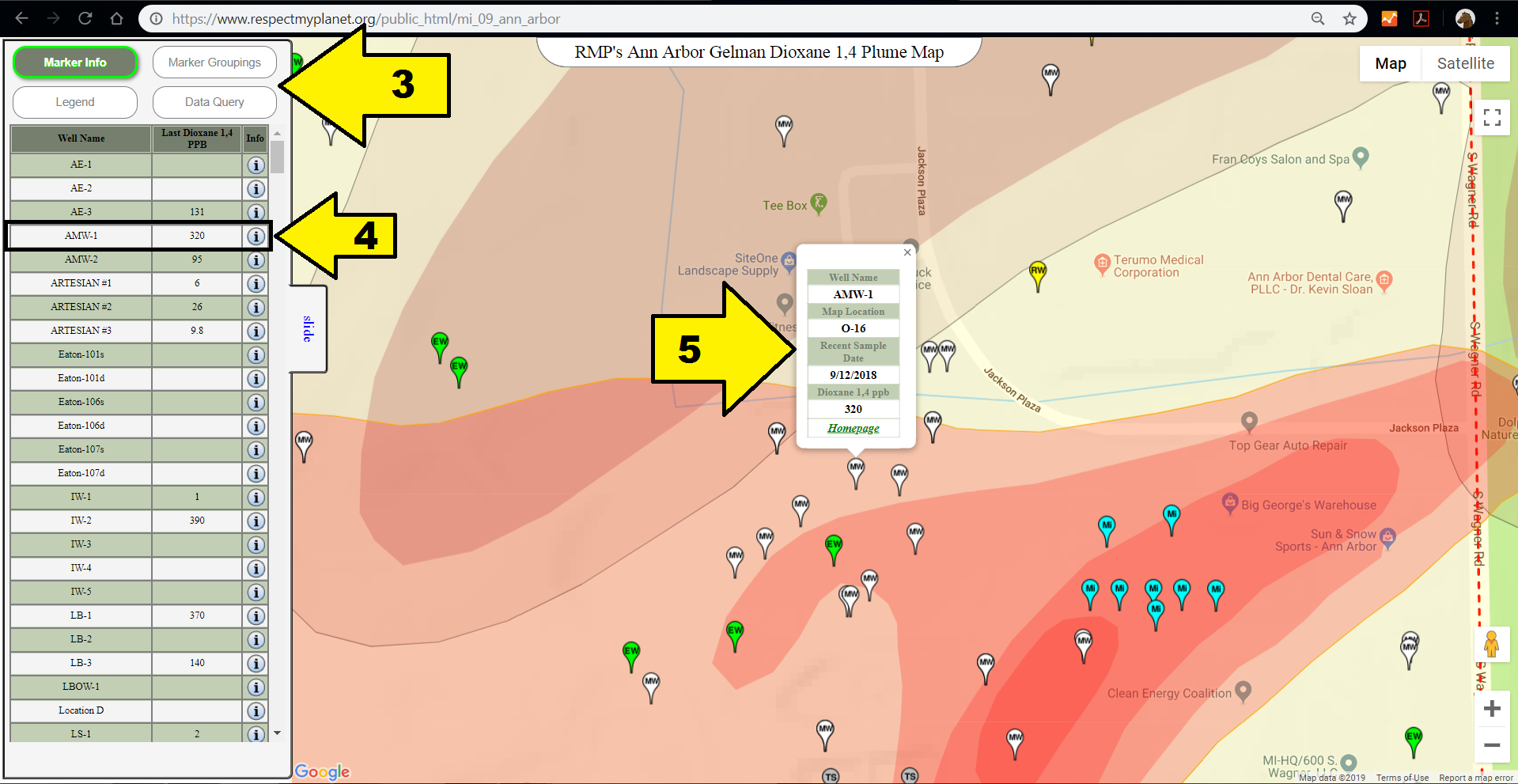
Arrow #3 – There are four buttons that each represent a different panel of data. When you first slide out the control panel, the “Marker Info” panel is highlighted. Clicking on the “Marker Groupings” button, “Legend” button, or “Data Query” button will open a different panel. Each panel will be briefly described throughout this post. The “Marker Info” panel shows a listing of all the 464 markers on the map along with their respective name, latest parts per billion Dioxane 1,4 value from the most recent sampling data, and an “info” icon. If you click on the “info” icon, it will open that marker’s info window on the map.
Arrow #4 – The “AMW-1” well is randomly selected here. If you click on the “info” icon next to this well, it will open that well’s info window as seen in Arrow #5. The map has been zoomed in a little bit so you can see this well a little closer up. You can zoom in or out to your heart’s content like you would using any Google map.
Arrow #5 – This is the info window for the AMW-1 well which happens to be a monitoring well which is colored white with the letters “MW” on it (more on the different well types later). In the infowindow, you can see a little more information about the well plus you can see exactly where that marker is on the map. In the case of the AMW-1 well you can see it’s last sample date was Sept 12, 2018 & its last sample reading was 320ppb of Dioxane 1,4. You’ll also notice there is a link in the info window for this location’s homepage. Each well has its own home page. If you click on the “homepage” hyperlink, it will open the location’s homepage where you can learn more information about that location. We will take a look at an example of a well’s location homepage later.
Control Panel – Marker Groupings
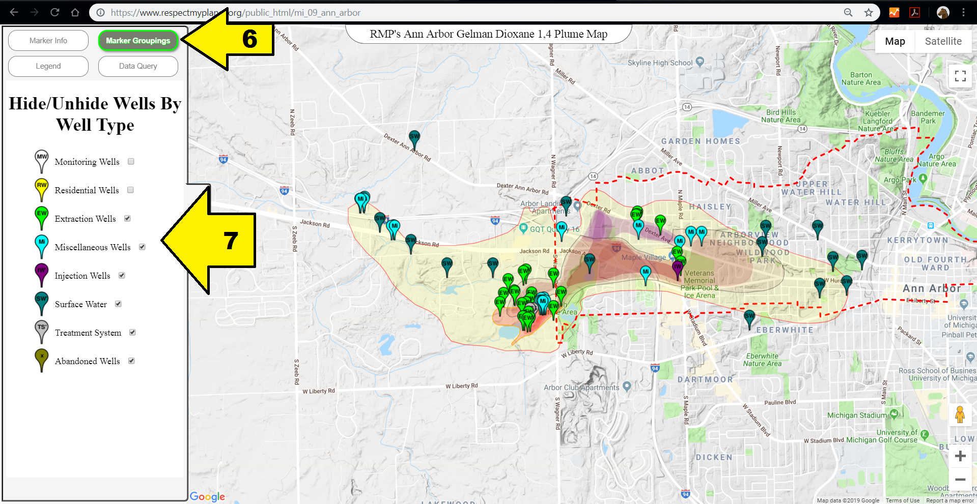
Arrow #6 – Click on the “Marker Groupings” button to display the marker groupings panel. You can see whichever button you click becomes highlighted. In this panel, you can hide & unhide markers by type. This powerful feature allows you to see the map from different perspectives.
Arrow #7 – By selecting or deselecting different marker groups, you can see different features. Perhaps you only want to see Extraction Wells or only monitoring wells, just select & deselect markers by group here. In this screenshot, Monitoring Wells & Residential wells are not visible.
Control Panel – Map Legend
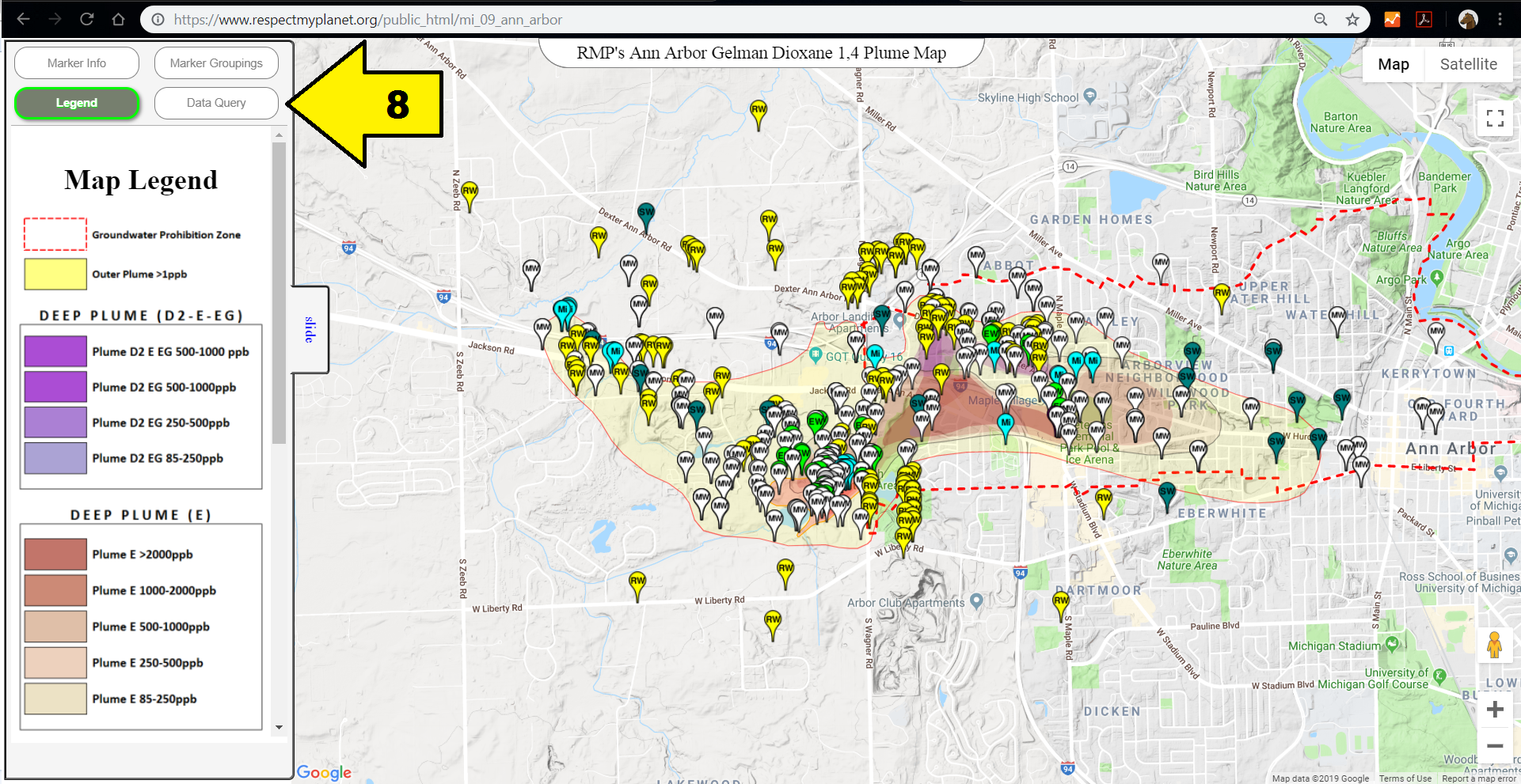
Arrow #8 – If you click on the “Map Legend” button, you’ll see the listing of different plumes & the marker types. The Map Legend shows the descriptor colors for the contamination by parts per billion. The plumes are easiest to see if you hide all the markers from the “Marker Groupings” tab so you can see just the plumes. The plume data points come from SRSW and the colors are 20% opacity so each “plume within a plume” looks darker. So the darker the color, the more contaminated that area. The outer plume is the extent of the plume and the red dashed line is the groundwater prohibition zone. You can scroll down the panel to see all the different plumes & the description of the markers.
Data Query – The data query section is something under construction but this is going to be where you can query different views of the map. For example “show me all the sites with Dioxane 1,4 greater than 1000ppb” or “show me all locations sampled in the last 365 days”. The data is available for these queries but it takes time and money to set up new & exciting features. Please consider making a tax deductible donation by clicking here so RMP can hire more labor to keep writing the code for the coolest & most informative maps related to environmental remediation & sustainable energy. Support Michigan made software 🙂
Location Homepage Screen
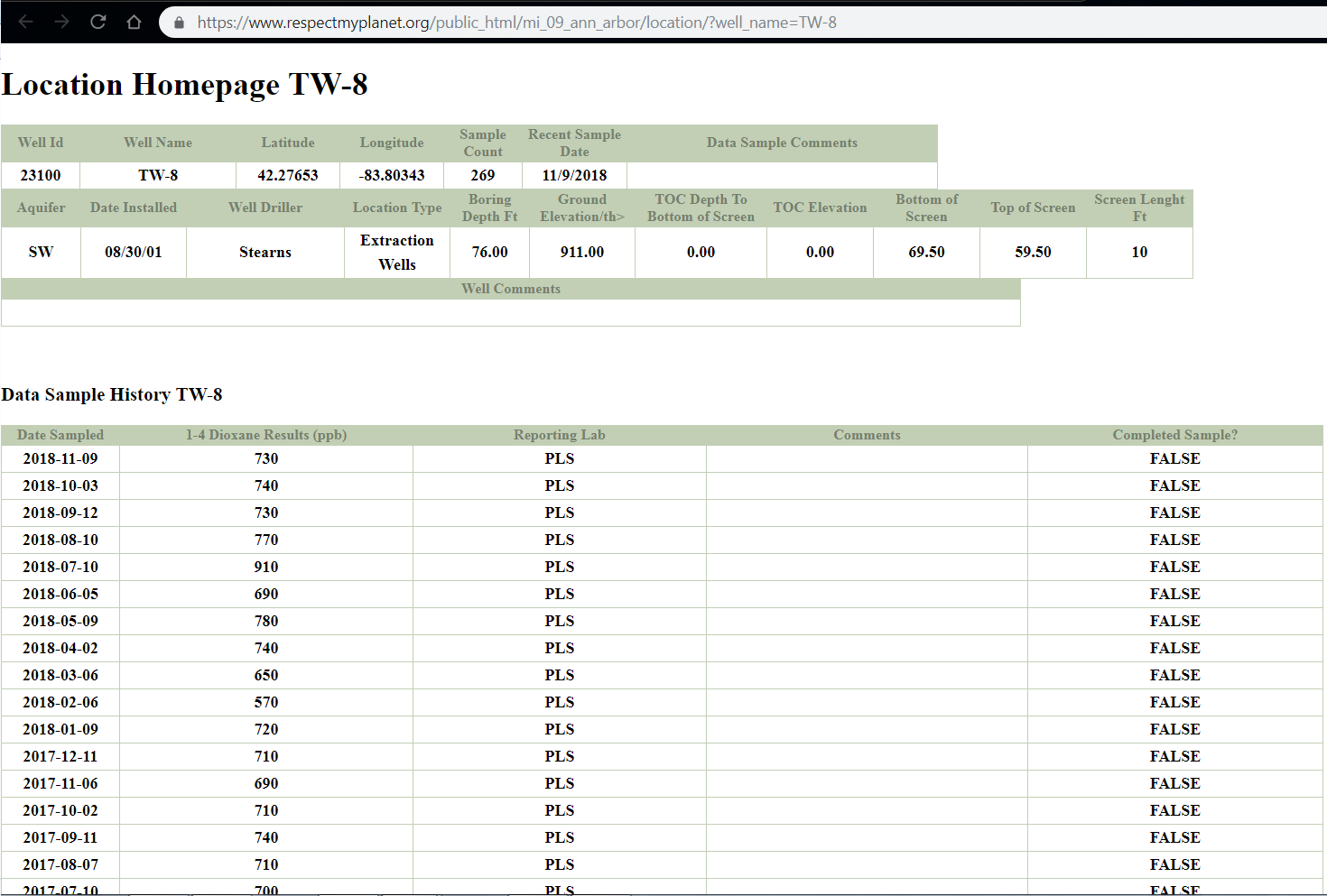
If you click on the “homepage” link on any location’s infowindow, you will open the location’s homepage where you can find more information about that particular location. Every single location (i.e. map marker) has its own location homepage where you can drill down to get more information about that location. In the example pictured, you can see the extraction well TW-8. Below are a few of the many things you can learn about this particular location:
- Who drilled the well: Stearns
- How many times has the water been sampled at this location: 269 times
- How deep is the top of the well screen: 59.5 feet
- How deep is the bottom of the well screen: 69.5 feet
- When was this location’s water sampled last: November 9, 2018
- What was the last sample’s Dioxane 1,4 content: 730ppb
You can click on any other location to find similar information. RMP’s software will retrieve the data from the EGLE data sources provided to the public.
Where Does The Data Come From:
RMP gets our data from the Gelman Sciences, Inc. Site of Contamination Information Page hosted by Michigan’s EGLE. The polygon’s for the contamination plumes come from the SRSW – Scio Residents For Safe Water web page.
The bulk of the data from EGLE comes in the form of a Microsoft Access database found at the link above. Within the database, there are two key tables that RMP uses to make this map: the “wells” table and the “data” table. The “wells” table lists over 700 unique locations but only the approximately 460 locations have XY coordinates that can be converted to latitudes & longitudes. Those locations in the wells table represent the markers you see on the map. The locations without coordinates cannot be displayed. The “data” table has approximately 50,000 records and is always expanding as new samples are taken. The “data” table allows RMP to relate the well name to the sampling data and display each location’s history of sampling.
The data related to the Gelman Dioxane Contamination Plume has been accumulated over decades and costs associated with collecting & compiling the data are anyone’s guess but certainly some multiple of million dollars. The same data is available to everyone for review through the EGLE website. What sets RMP apart from other organizations is our software. RMP’s software connects all of EGLE’s data to a Google map and allows anyone with an internet connection to interact with the data in a way that has never been done before. You don’t need expensive ARCGIS software. You don’t need to install Google Earth and load KML files. You no longer have to be relegated to the pdf & jpg images you see in newspaper articles where it’s hard to see what you’re looking for. All you need is an internet browser & an internet connection and you can zoom in & out on all the available data points and see decades worth of sampling history in an easy to use format. And, if your budget is like ours, more great news: our maps will always be free to the public.
RMP’s Gelman Dioxane 1,4 Plume Map is a demonstration map of our software. RMP has gigabytes of other data from Michigan’s EGLE that we would like to put into our new Generation 2 mapping software. RMP plans to map the Wurtsmith Airforce Base #PFAS contamination, the Back Forty Goldmine on the Menominee River, the Zephyr Petroleum Storage Tank contamination in Muskegon, the Wickes TCE Contamination Plume in Antrim county, dioxin contamination in the Upper Tittabawassee floodplains of Midland downstream from Dow Chemical, and many more. There are many map applications out there but none are as easy & fast as RMP’s regular old Google map using Google’s powerful & fast servers.
RMP is a Michigan based 501(c)3 organization with annual revenues on average of under $100 dollars. Everything you see on this website is a result of volunteer effort and good software. We need money now to make it to the next level of bringing the best software in front of more people. RMP believes we can teach more children & more adults about environmental sciences, water protection, and sustainable energy because our software is more powerful than what any other environmental organization has. Look at what you can do with this one demonstration map. People with no knowledge of the extent of the Ann Arbor Gelman Dioxane Plume can learn as much as any expert in no time flat by using our software & website. Teachers can teach students in their classrooms and show them real data that tax payers have spent millions of dollars on over the decades. RMP’s software brings very valuable data sets to life in an organized, easy to use, and fast application that allows anyone to learn what is going on and where. Would you please consider making a tax deductible donation to RMP by clicking here to use our secure PayPal page. You donation will help us get good reliable information to more people across Michigan and around the world. Thank you so much for your support.

Hello, my name is Clark Coriell, and I am a student at EMU. I am doing a final project of the Ann Arbor dioxane plume in my geography class and I would like to ask for data sharing regarding your wonderful map of the water issue in Ann Arbor? Where did you get this map, and if it was produced in-house, would I be able to download it and apply to a GIS map I am making for my class, with citations of course? Thank you for your help and have a great day.
Clark, in the “Where does the data come from” section of the post, there are two links to the sources of the data. The plume outlined maps come from SRSW – Scio Residents For Safe Water & the well location data comes from the Michigan EGLE. RMP took those two data sets and just plotted them on a Google Map. You can down load the data from the two links above. Good luck on your project and thanks for checking out our map. You’re also welcome to use a direct link to the map: https://www.respectmyplanet.org/public_html/mi_09_ann_arbor