Tag: h2
-
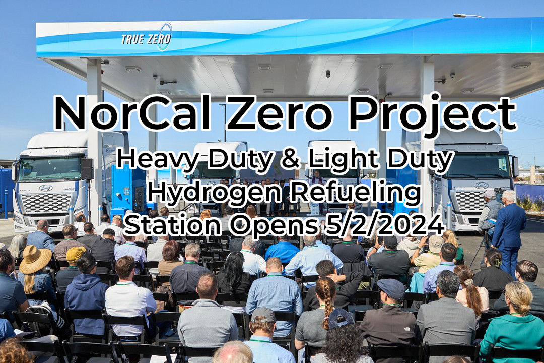
NorCal Zero Project
It is a milestone day for hydrogen refueling. The Center for Transportation and the Environment announces the inauguration of the NorCAL ZERO project. This new station can serve up to 200 Class 8 heavy duty trucks per day. It has a capacity of 4,000 kilograms of LH2. The station also can refuel class 1 vehicles and…
-
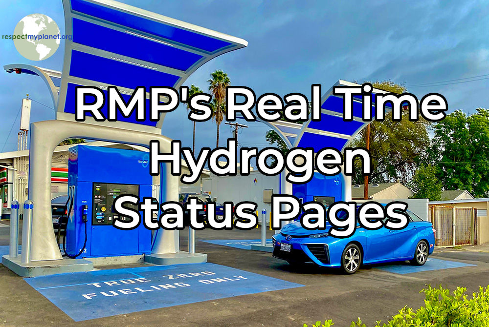
RMP’s Real Time Hydrogen Station Status Pages
RMP has upgraded our California hydrogen maps by including a new map for real time station status and a new map for stations coming soon. All stations reporting SOSS status in California are summarized on our landing page at this link and shown below (Figure 1 ). All of the pages covered in this post…
-
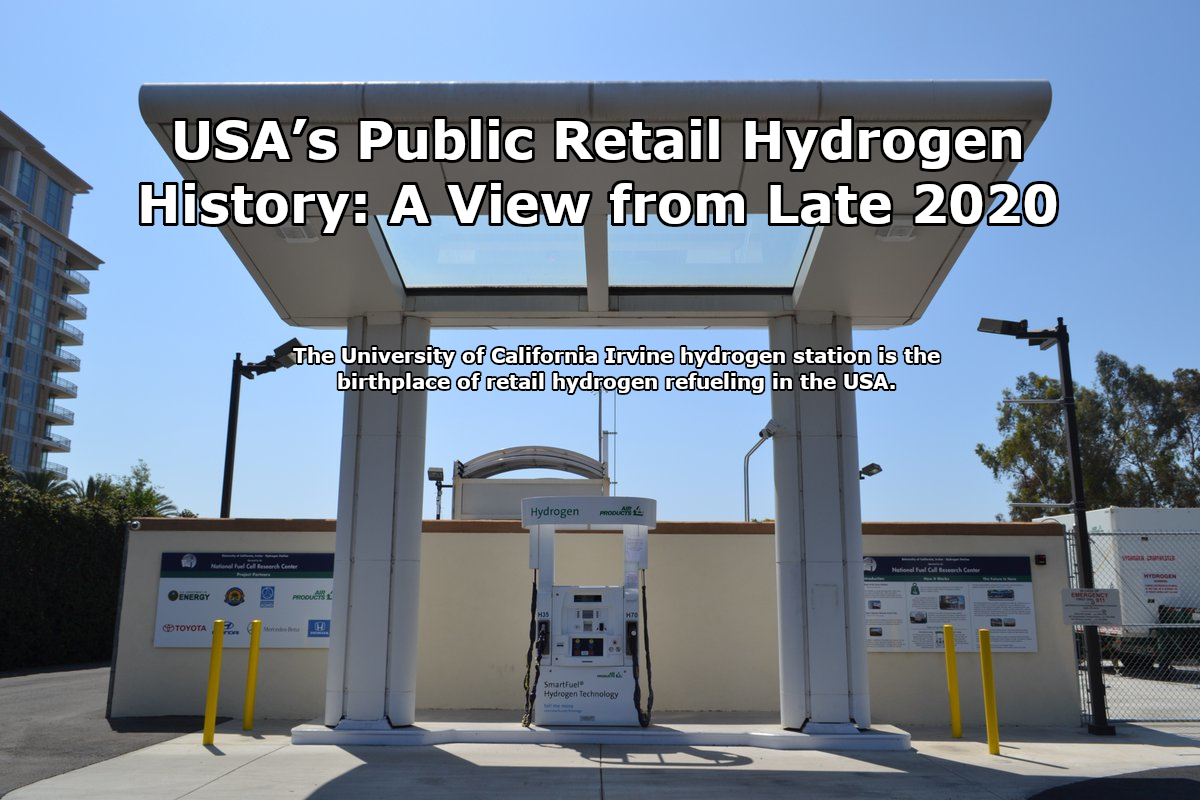
USA’s Public Retail Hydrogen History: A View from Late 2020
The new hydrogen stations opening in California are not like the ones from four years ago, they’re massive. These new stations have 1,200kgs of capacity & can be replenished in a couple of hours and keep on refueling. These new stations mark a step change in hydrogen refueling scale and represent a great time to…
-

Quarterly USA H2 Report Becomes Quarterly USA & Canada H2 Report
RMP is based near Detroit, Michigan. The Detroit River separates the City of Detroit & the City of Windsor. The Ambassador Bridge connects the two cities and soon the Gordy Howe International Bridge, a once in a generation undertaking, will be a second major bridge connecting the two cities. Windsor is my personal connection to…
-

USA Quarterly H2 Infrastructure Update 2018-Q2
H2 infrastructure is growing all across the USA and especially in California. New H2 stations are planned all across the East Coast too. RMP will now regularly be publishing a quarterly update of H2 infrastructure all across the USA to keep our readers informed of what’s going on. Check out our USA H2 Infrastructure Quarterly…