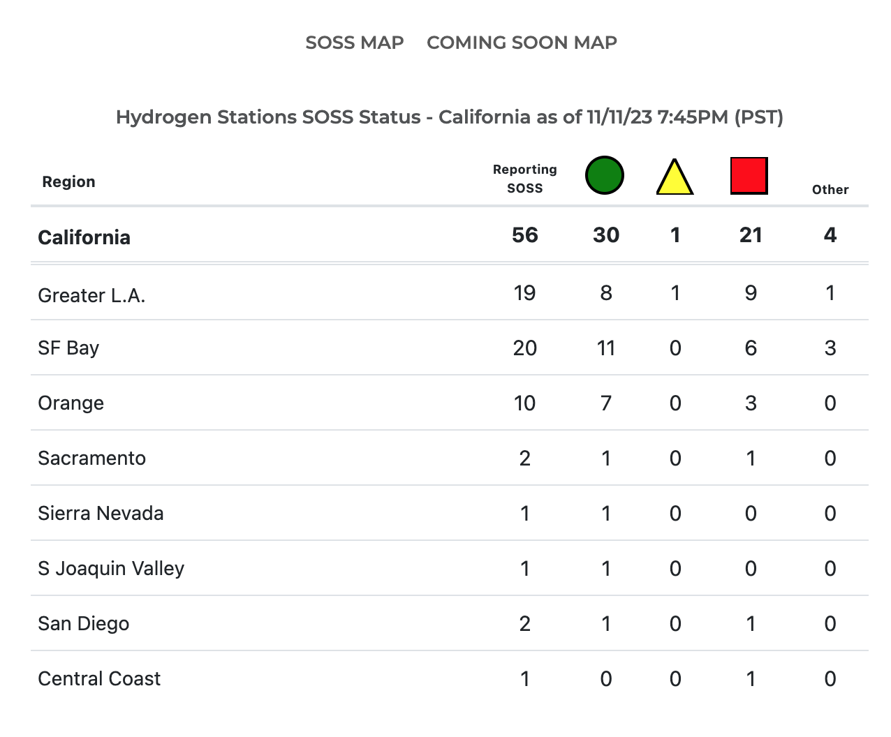
RMP has upgraded our California hydrogen maps by including a new map for real time station status and a new map for stations coming soon. All stations reporting SOSS status in California are summarized on our landing page at this link and shown below (Figure 1 ). All of the pages covered in this post and associated maps are optimized for mobile devices so drivers in California can use them to find the nearest station and its current status easily on their phones. But, the pages are also designed to work well on a desktop computer where it’s a little more fun to analyze the maps on your big screen at home if you want to dig deeper into data analytics.
California Summary Page:
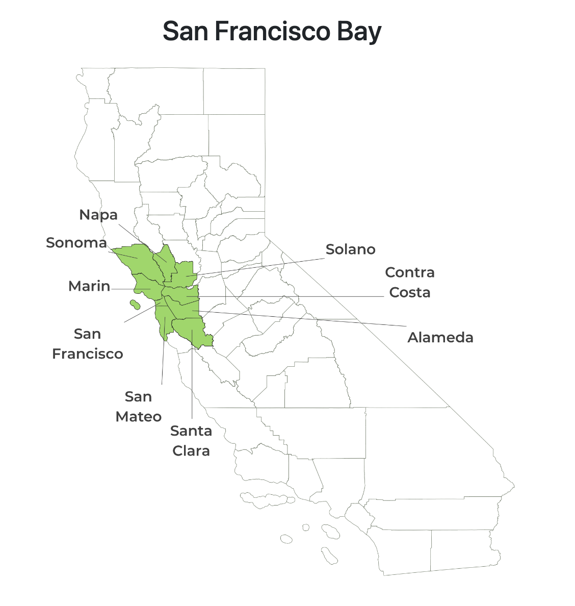
At the time of this writing there are 56 stations open to the public for retail sale of H2 in California and they all report their status via H2FCP.org’s SOSS server. There are several more stations in various stages of development that will eventually come online and be open for retail business. When the commissioning of a new station is complete and it comes online, it will report its first SOSS status and be added to the table by county/region. RMP summarizes all stations by county and region. RMP has divided California’s 58 counties into 14 regions (Figure 2). Each region has at least one county (Orange county and San Diego county are both single county regions).
Scrolling down past the summary data table on the live page, you’ll see a graphic of California broken up into these 14 regions (Figure 2 ). Only regions with open stations or stations coming soon are shown in the data table, but all regions are shown in the graphic. Within each region, you can see this boundary lines of each county within that region.
RMP’s landing page shows a table of the real time status tallies of all stations in California by region. You can see how many stations are online now, how many have limited availability now, how many are offline now, or have some other status. The SOSS server reports one of six statuses for any given station:
1 = Online (Green Circle)
2 = Limited Availability (Yellow Triangle)
3 = Offline (Red Square)
4 = Unknown (Gray Triangle – “Other” on main page)
5 = Closed (Gray Square – “Other on main page”)
6 = Refresh (Blue Square – “Other” on main page)

From the main landing page, you can see the overview of the whole state and each region and you can drill down on more detail for each region. You can click on the SOSS MAP to see all the retail stations on a Google Map, you can click on the COMING SOON MAP to see all stations in development, or you can click on any region to see a detailed listing of all stations, their current status, and their current inventory in kilograms. If you click on California, you will see a detailed listing of all stations in California and their associated status & inventory in kgs. The last updated time is always stamped at the top of the page in Pacific Standard Time (PST). RMP pings the SOSS server once every 15 minutes on the quarter hour and takes a snapshot of all station statuses. Therefore, the statuses you see are always no more than 15 minutes old when you load the page.
Regional Listing Page:
When you click on any region from the main page, you’ll launch a regional page and see a detailed listing of all stations in that region as well as their associated status & inventory level (Figure 3). At the very top of the regional page you will again see the SOSS MAP link and the COMING SOON MAP along with the additional SHOW GRAPHS link. When you first load the regional page, the graphs are hidden. If you click the SHOW GRAPHS link, you will see a graph of the last 24 hours of station status & inventory. Each graph shows the station’s status & inventory in 96 different bars representing 15 minute increments over the past 24 hours. The height of the bar represents the inventory level in kg and the color of the bar represents the status at the time the status was read from the SOSS server; same color coding as described above for each of the six different statuses. If you’re using a desktop computer, you can hold your mouse over the graph to see the time stamp and inventory level in more detail, if you’re on your phone or an iPad, lightly drag your fingertip across the graph to see the same.
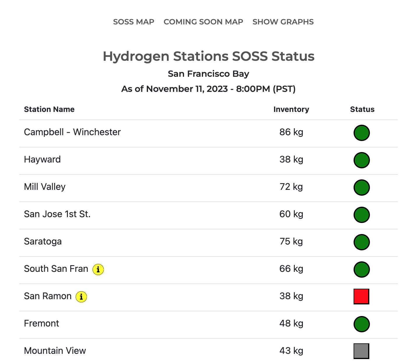
Again, the timestamp of the data you’re seeing on the regional page is always shown at the top of the page to let you know the time the status snapshot was taken. All stations in the region are listed corresponding to the count tallies you saw on the summary page. If you see an “i” icon next to the station’s name, it indicates the station has a special information message being broadcast from the SOSS server. You can click on any station to go to that station’s homepage where you can find additional details about the station including the information message. Below the table of stations listed on the regional page is an infographic showing the counties included in that region (Figure 4).
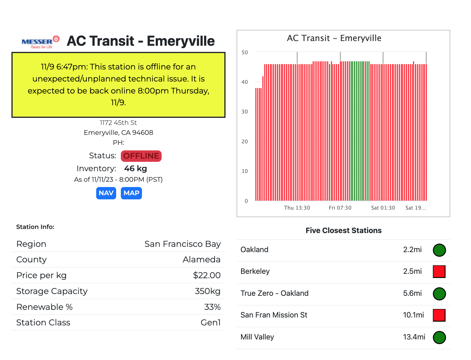
Station Homepage:
The station homepage has additional station details for each specific location. If the station was marked with an “i” icon on the regional page, you will be able to see the information message on the station homepage in a yellow info box just below the station title (Figure 5). Along with the status and inventory message, you will also find additional station information like address and phone number. The graph on the home page is similar to the graph on the regional page but shows activity over the past 3 days in 45 minute increments to show a longer horizon. You can also see the 5 closest stations and their status. You can also see the 5 closest stations coming soon (not pictured).
In Conclusion:
RMP is now hosting three basic real time pages: a California summary page, a regional page for each region, and a location homepage for each refueling station. Please check them out and make a bookmark if you like it. As always, check with H2FCP.org for official information.
The official URL for RMP’s Real Time Hydrogen Status landing page is:
Leave a Reply